Color theory is both the science and art of using color. It explains how humans perceive color; and the visual effects of how colors mix, match or contrast with each other. Color theory also involves the messages colors communicate; and the methods used to replicate color.
In color theory, colors are organized on a color wheel and grouped into 3 categories: primary colors, secondary colors and tertiary colors. More on that later.

So why should you care about color theory as an entrepreneur? Why can’t you just slap some red on your packaging and be done with it? It worked for Coke, right?
Color theory will help you build your brand. And that will help you get more sales.
People decide whether or not they like a product in 90 seconds or less. 90% of that decision is based solely on color.
Color is perception. Our eyes see something (the sky, for example), and data sent from our eyes to our brains tells us it’s a certain color (blue). Objects reflect light in different combinations of wavelengths. Our brains pick up on those wavelength combinations and translate them into the phenomenon we call color.
When you’re strolling down the soft drink aisle scanning the shelves filled with 82 million cans and bottles and trying to find your six-pack of Coke, what do you look for? The scripted logo or that familiar red can?
People decide whether or not they like a product in 90 seconds or less. 90% of that decision is based solely on color. So, a very important part of your branding must focus on color.

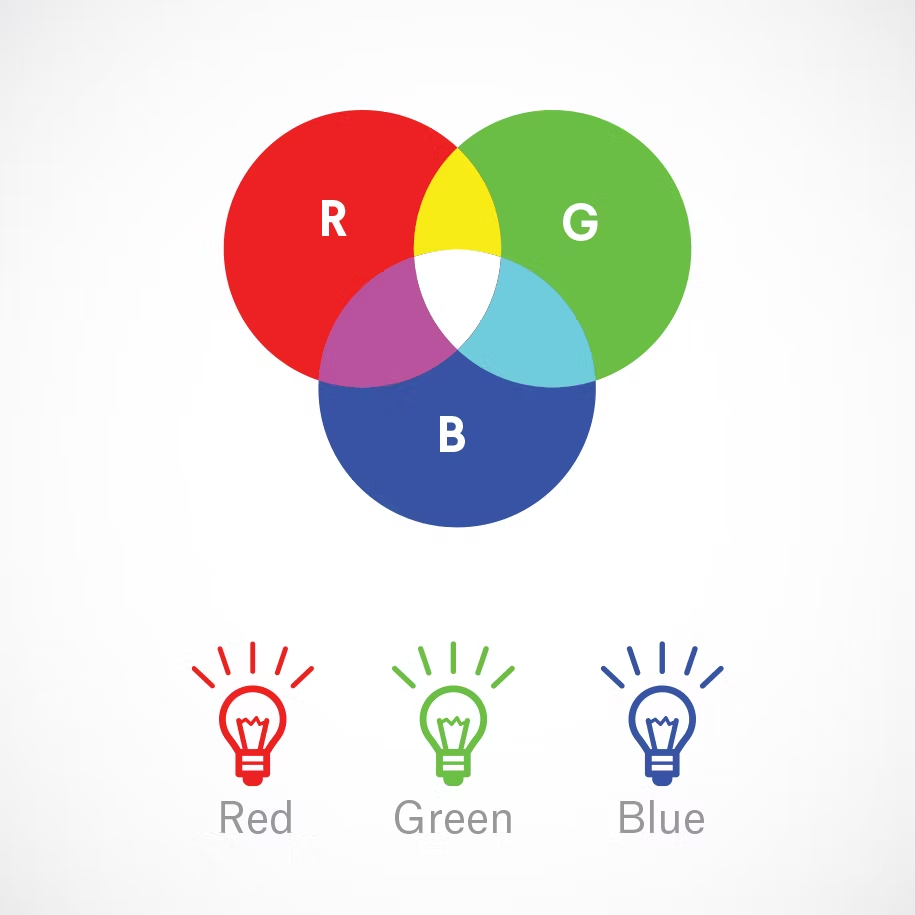
Additive color mixing. If you (like me) have a hard time wrapping your head around how red and green mix together to make yellow, watch this YouTube video.
Humans see colors in light waves. Mixing light—or the additive color mixing model—allows you to create colors by mixing red, green and blue light sources of various intensities. The more light you add, the brighter the color mix becomes. If you mix all three colors of light, you get pure, white light.
TVs, screens and projectors use red, green and blue (RGB) as their primary colors, and then mix them together to create other colors.
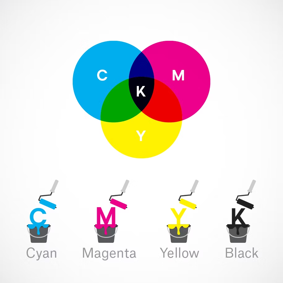
Let’s say you have a very distinct brand with a bright yellow logo. If you post the logo on Facebook, Twitter or your website and don’t use the correct color process, your logo will appear muddy instead of that bright yellow. That’s why, when working with files for any screen, use RGB, not CMYK.
Any color you see on a physical surface (paper, signage, packaging, etc.) uses the subtractive color mixing model. Most people are more familiar with this color model because it’s what we learned in kindergarten when mixing finger paints. In this case, “subtractive” simply refers to the fact that you subtract the light from the paper by adding more color.
